1652286983812 Color Play

4 Simple Ways to Add Wayfinding into Your Facility

Aug. 29, 2018

Whether one is looking for an office, a bathroom or the public transport system, how they are able to navigate throughout a facility can make or break the experience. Often, visitors don’t realize the impact that finding their way has on their overall opinions of a space, but that doesn’t mean building owners and facilitators shouldn’t have wayfinding top of mind.

We’ve all had the experience of entering a building and suddenly being lost.

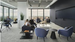
Whether one is looking for an office, a bathroom or the public transport system, how they are able to navigate throughout a facility can make or break the experience. Often, visitors don’t realize the impact that finding their way has on their overall opinions of a space, but that doesn’t mean building owners and facilitators shouldn’t have wayfinding top of mind. (Pictured: Sticky acoustic panels are becoming very popular. They can be used for wayfinding as well. Xorel Artform by Carnegie)

Wayfinding is the use of signage, color and other design elements that helps one orient themselves and navigate within a physical space. The most optimal wayfinding is incorporated into the initial design of the building, but if your facility is already completed, there are easy ways to integrate it into an existing floor plan.

1. Lighting

Lighting is often considered one of the one-and-done aspects of design, particularly now that LEDs provide long-term solutions. Even if you’re using non-LED lighting, most systems are created to easily switch out the bulb rather than start from scratch.

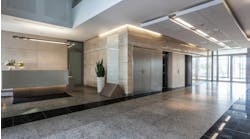
However, if you’re looking to install new lighting or have the ability to change the placement of existing light fixtures, lighting can become one of the simplest ways to create subliminal wayfinding. (Pictured: RXR Realty used Junipers THIN Primaries around doorways and in a consecutive direction to point visitors on their way.)

For high-traffic areas, particularly where visitors are coming in and out of the space, lighting can be used to provide direction and symbolize stopping points in these two ways:

  • Provide direction: Install tube lighting or tracks vertically along the main pathway. Lighting that runs in the same direction that one should move gives users something to follow without a blatant arrow pointing down the walkway.
     
  • Symbolize stopping points: In video games, a computer-controlled person of interest is often lit from above or below. Similar tactics can be used in the real-life physical space as well. Reception desks can utilize lighting in different ways than the rest of the space. This can be done by installing LEDs under the counter’s visitor-facing surface, concentrating overhead lighting above the desk or back-lighting the counter through the use of lights placed on the wall behind the desk.

Another popular use of lighting to create points of interest is through geometric lighting fixtures. Taking the places where chandeliers once held dominance, square, circular, triangular or polygonal options are available either ceiling-flush or suspended. (Pictured: Suspended geometric lighting systems are an easy way to install eye-catching lighting that can point out places of interest. Juniper THIN Primaries, Courtesy of Juniper)

By hanging geometric lighting above a reception desk, waiting area or other points of interest, visitors are informed that this is a place they should be attracted to.

2. Flooring

In the interior design industry, we’re seeing huge changes in carpet overall. The most important one for building owners and facilities managers is the fact that wall-to-wall (broadloom) carpets are out.

Instead, modular carpet tiles provide not only unique design solutions, but a less costly option in flooring as individual pieces can be replaced when damaged and stained rather than the whole floor.

(Pictured: Flooring collections are designed to be mixed and matched to create wayfinding options. Drawn Lines by Interface, one of our Merit Prize winners from our Product Innovations 2018 contest, can be used to install a “Yellow ‘Brick’ Road” here.)

Because of the popularity of carpet tiles, flooring manufacturers are creating designs that can be used for wayfinding through installation direction, pattern, color and material:

  • Installation direction: Like with providing direction through lighting, rectangular carpet tiles can be installed parallel to the way in which visitors should walk, providing a subtle point in one direction. Herringbone is another popular installation design with a less subtle—but still not blatant—ability to literally point someone in the right direction as it creates an arrow pattern. 
     
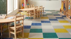
  • Pattern: Flooring manufacturers know that their products will be used for wayfinding, so you’d be hard pressed to find collections of carpet and flooring tiles that don’t have several patterns. Even ceramic or porcelain tiles incorporate different finishes and patterns into their collections so that either progressive or blunt changes in the design can act as optimal wayfinding techniques. (Pictured: Color Play by Tandus Centiva)

    Color: Similar to the new patterns found in flooring collections, many manufacturers are incorporating color as a wayfinding technique. Playing with gradient colors provides walkways. Think of it like the Yellow Brick Road, but with fewer unfulfilled, animated fellow travelers along the way (we’re assuming). (Pictured: Carpet tiles are frequently designed with gradients along the length for pattern and color-based wayfinding. Nutopia by Mohawk Group)

  • Material: Mixing carpet, LVT, wood and/or tile is another great way to create wayfinding. By keeping one material type along the pathway you would expect a visitor to follow, they will be less likely to wander. Many buildings already do this unintentionally: think of interiors where carpet is used throughout except staff-only spaces, which use LVT or tile. Most of the time, this is cost-effective as the flooring in staff-only spaces deals with more wear and tear, but the same idea can be used throughout in an intentional way.
  • 3. Color

    Like we point out above, color can be a successful wayfinding technique in carpeting, but the same idea can be applied to walls, furniture, partitions and more. Color can also be the easiest method of wayfinding for existing spaces:

  • Walls: Often called an “accent wall,” painting a single or consecutive walls in a different color or covering it with a different surface material than the rest of the space gives users the impression that they should follow that path. 
     
  • Furniture: Similarly, you can use the color of furniture to delineate different spaces in a building. Updating the upholstery on existing furniture or replacing with new pieces in similar colors can create visual boundaries in a space.
     
  • Partitions: Due to the influx of open office layouts, there are more partitions available than ever before, which can be used for a variety of purposes. Whether using a floor-to-ceiling system or clip-on desk partitions, partitions let visitors know which spaces are out of bounds. (Pictured: A wide variety of partition systems exist now to create boundaries that dont snub design, such as the PIXA Grid by Sensitile Systems, one of our Merit Prize winners from our Product Innovations 2018 contest - Image courtesy of Sensitile Systems)

    A few of the products highlighted in this article are also winners of our 2018 Product Innovations contest.

    Check out these other innovative ideas for your facility!

    4. Signage

    Of course, the simplest way to create clear wayfinding is to make sure that signage is clear, legible and at appropriate intervals. If someone needs to guess whether their destination is just around the corner or on the other side of the building, it can cause frustration.

    One thing of note: if your building is often host to people of varying languages, it’s important to include symbols where applicable.

    Signage doesn’t need to be a hassle, either. There are plenty of companies out there that produce creative standardized signage packages, and vinyl sticker decals are perfect stick-and-go options that can be installed nearly instantly. And when all else fails, chalkboard sandwich boards are making a huge comeback in design.

    Two hand-picked articles to read next:
    About the Author

    Kadie Yale | Former Architecture & Design Expert

    Kadie Yale holds a BA in Industrial Design from San Francisco State University and MA in Decorative Art History and Theory from Parsons the New School.

    Voice your opinion!

    To join the conversation, and become an exclusive member of Buildings, create an account today!

    Sponsored Recommendations