Capturing the Colorado environment surrounding the midrise building at 3401 Bluff St. in Boulder, Colo., challenged the design team at Stantec to balance Twitter’s interior design with its signature blue color alongside the rustic and outdoor features around town. The goal for the four-story office space was to entice workers back to the office with personalized design touches and space flexibility.
“You can go and sit and work, but yet you can see people and talk to people and have some energy,” said Rachel Fitzgerald, principal and discipline lead. “It was not designed as a head-down cubicle farm in getting people back to the office after COVID.”
Vertical Lighting
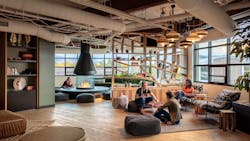
With programming nearly completed, the Stantec team was prepared to take the next step in the project when the COVID-19 pandemic started. They headed back to the drawing board, moving away from the traditional desk set-up and conceptualized spaces for use after the pandemic. Their ideas included phone rooms, collaboration spaces and a café. There is also a fireplace and swinging chairs with views of the Flatirons and foothills of Boulder to help connect users with nature indoors.
As the pandemic extended lead times and limited product availability, it also hindered the options within budgetary constraints. The tight budget for the design aspirations required Stantec to maintain open communication with the client about pricing and the impact of each selection on the budget.
The lighting design team selected color tuning fixtures for the space, which had longer lead times for shipment. In addition to the project’s launch in March 2020, another challenge was the space’s short deck-to-deck height on the upper floors and the exposed ceilings, which required extensive system coordination.
“We didn’t have the headspace to drop any traditional acoustic ceilings, so we had to figure out how to place our lights with mechanical systems in the exposed structure,” said Vannessa Pederson, senior lighting designer with Stantec.
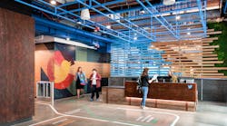
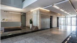
The designers elected to use architectural luminaires providing vertical lighting to draw the eyes away from the exposed systems in the ceiling and towards the corridors and artwork as well as to pick up the light to set the tone of each space. For example, the simple lighting highlights the Twitter logo and Colorado flag in the reception area.
Pederson said vertical lighting is a technique “to use less light. Your eye picks up more of the vertical light than the horizontal light, so it’s a good, judicious use of light.”
Lighting Each Space
The first floor of the building features the reception and cafeteria. The lighting was kept low key through integration into the ceiling, except for the lights that illuminate the hashtag emblem bench. The cafeteria space can transform to a TED Talk space, if needed.
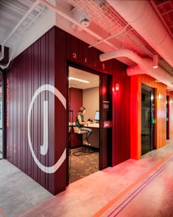
The second and third floors function as lab rooms and phone rooms, located around the central core. The phone rooms are designed to resemble shipping containers with a tunable white lighting system. The system features dimming, correlated color temperatures that mimic daylight and an occupancy device in the room to switch the exterior wall light from white (unoccupied) to red (occupied). The default settings for the lighting system would adjust color temperatures from warmer in the morning, cooler during peak daylight and then warm toward sunset, although occupants could change that to suit their needs. The lighting control is all connected through the same type of cabling as ethernet cabling, Pederson said.
“[Tunable lighting] was, at the time of the design, an emerging technology that I think we’ll continue to see more and more of, and around this time was when we were starting to see some wholesale adoption of it on some projects,” Fitzgerald said. “Previously, more of the use had been in research or wholesale studies or healthcare. For us, this was one of the first mainstream design projects trying to integrate this technology without notable budget increases.”
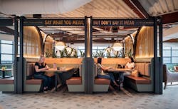
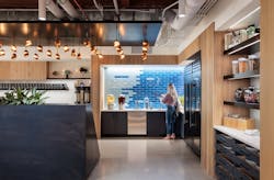
The fourth-floor café features a bar area with a nearby train caboose to highlight the railroad. It is lit with warm lighting commonly found in coffee shops. Warm light illuminates the top of the fluted wall around the counter and acts as a beacon to help guide workers to the coffee barista. Copper mesh and decorative pendants complete the space, known as the rail yards. Also on the fourth floor is the ski lounge, featuring warm lighting and a built-in fireplace. The light cluster centers the seating group, creating a space within the room for occupants to play games or read a book. The space is technology-free with board games available in the relaxing space.
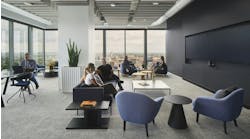
In addition to the secluded spaces, throughout the office are larger team focus rooms wired with top notch technology and mothers' rooms that feature hospital-grade equipment as an enticement to return to the office. The team rooms’ lighting is fully adjustable with options to illuminate the walls or desks and for up or down light along with color temperature.
Boulder’s energy conservation code strives for net zero energy (NZE) residential and commercial buildings, with a supporting commitment to adopt NZE design for all buildings by 2031. For that reason, the designers had to use lighting judiciously, opting for more lighting in the collaboration spaces and subtle lighting along the circulation pathways . The vertical lighting accentuated the space and its textures, materiality and artwork.
Another unique lighting pendant is made from recycled cardboard. The pendants are connected to a custom ceiling element that allows plug and play installation.
The project was completed in August 2021.
This evolution in project design is indicative of what designers are seeing in the workplace post-pandemic. Business leaders are looking for ways to entice workers back to the office with elements that feel like home and new technology to push industries forward.
“I think this was a really cool model from an interior design, space planning and use of space [point of view],” said Fitzgerald. “Then, from our standpoint, how the lighting is so flexible and well-integrated. It was all kept simple from a user interface but had tons of flexibility to make it feel like home, like a focused workspace and adapt to different users.”
