Colorful and Bold, Method Architecture’s Houston Office Inspires Designers and Clients Alike
Serving as a place of creativity and inspiration for the studio’s designers and clients, Method Architecture did not hold back with a bold, vibrant and out-of-the-box design for its Houston office.
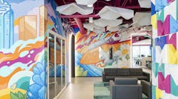
With a 49-foot, 2-inch linear multi-wall mural, large acoustical baffles, archways, bright colors and more, the 8,612-square-foot office portrays a welcoming, upbeat vibe.
“By pushing the limits of our own office design through blending color, pattern and texture, we created a vibrant, innovative space where clients can dream. This allows us to encourage our clients to be open to approaching design differently, using our office as a library of inspiration,” explained Ashley Bettcher, a research and design specialist with Method.
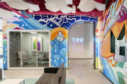
Upon entering the offices of the minority-owned firm, one’s senses are awakened with vibrant hues of blue, green. yellow, orange and pink. And employees and visitors come face to face with a larger-than-life mural painted by local Houston artist David Maldonado depicting the skyline, city and state flower, Space City and the neighboring Buffalo Bayou. Hidden elements include the firm’s quality mascot and a rubber duck, further creating a sense of customization and individuality within the space.
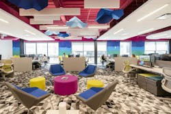
“Blending form with function, 40 star-shaped acoustical baffles were left exposed throughout to serve as a unique, geometric art moment complimenting the office’s bright pink ceilings while reducing echo and noise throughout the space,” said Bettcher.
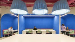
Curved archways with recessed lighting create dramatic openings. The curved design is mirrored in the break-room booths, which feature calming, blue-colored walls and drum-shaped light pendants where employees can eat, relax and socialize.
The Method team designed the floors with two styles of custom carpet with a free-flowing pattern that fades from deep gray to white. For the stylish seating, the architects repurposed chairs from their existing office for the open office areas.
In addition to the main mural in the entry, a secondary mural, also designed and installed by Maldanado, features drip paint in mirroring colorways located at the back of the office.
Overall, the colorful, animated environment helps communicate the idea that creativity has no limits and great design doesn’t necessarily need to cost more.
“The lively environment and vivaciously unique design are among the top impressions we receive from clients and visitors alike,” reported Bettcher. “Ultimately, it is the cohesion from space to space that stands out most to visitors, as maximalism can often be misjudged as chaos.”
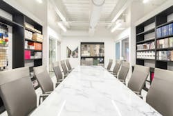
Contrasting the dynamic interiors is an all-white conference room where designers can present plans and materials for projects in a distraction-free environment.
The conference room is flanked by three medium-sized meeting rooms and two smaller huddle spaces, also designed with neutral colors and organic materials. Tunable white lights can be adjusted in each of the client spaces and a window cut-out of the Method Architecture logo adorns one of the walls, providing transparency into the design process.
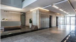
The reception area also features its own soundproof huddle room for guests and clients to have private conversations.
Project Process
Before arriving at the desired environment, interior design and blend of different spaces, Method’s designers began the design process with an intention to create a highly functional and flexible space to support different working styles where employees would be excited to come to work every day.
At the same time, the project kicked off right at the beginning of the pandemic. Amidst the volatility of the office market and the rapidly growing popularity of work from home trends, the designers were very challenged to imagine what the firm’s office culture and work style would look like post-pandemic.
That said, to best address team efficiency, collaboration and support from management and operational teams, the open office space underwent many iterations.
For example, the team thought to place the breakroom space in the back of the office. But in order to create more circulation through the area, a more central location was ultimately selected.
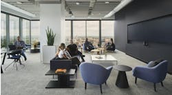
“The idea was to make the space a more active hub for informal meetings and gathering rather than simply a destination for meals and coffee,” explained Bettcher. “Moving the breakroom to the center of the office also broke up the length of the open office space, making it more accessible and creating intentionality for engagement.”
Overall, the design succeeded in creating informal, collaborative spaces between each work pod while also breaking up the space. This also supports flexibility for future growth and the ability to create space for more work pods and hoteling stations, if needed.
For this LEED v4 Silver, WELL v2 Certified project, sustainable features include ample windows for daylighting, demountable partitions reused from the previous office space, reused office furniture, low-VOC emissions, recycled content carpet tile and interior materials sourced from sustainability-focused vendors that prioritize carbon-neutral practices.
WELL features include a water bottle filling station, recycling bins, height-adjustable desks, ergonomic task chairs and dimmable office lighting.
