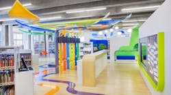
Stepping into the Jackie and Harold Spielman Children’s Library at Port Washington Public Library in New York is like reaching a destination.
The immersive environment inspires kids of any age with playful design, bold colors and an interactive landscape of learning.
(Library entrance: From the moment children approach the Jackie and Harold Spielman Children’s library at New York’s Port Washington Public Library, they’re transported to a destination all their own. The Tree of Knowledge theme greets them as they approach the door and weaves throughout the entire children’s space. A lenticular graphic by Duggal Visual Solutions drives that theme home as children pass through the doorway. Photo by John Wallen)
In the middle of it all stands a tree-inspired sculpture anchored at the librarian’s desk. This ceiling-height artwork—the most visible representation of the space’s Tree of Knowledge theme—sprouts branches and roots that stretch to specialized areas for early learners, tweens, caregivers, storytelling, quiet study, technology and a maker space.
In short, it literally grows young guests’ knowledge as it weaves throughout the library.
[Related: Designing for Special Needs Students]
It also serves as a clever organizational device based on Howard Gardner’s theory of multiple intelligences, which recognizes different learning styles and developmental stages, explains Lee Skolnick, principal of Skolnick Architecture + Design Partnership and lead designer on the Port Washington Public Library project.
“We wanted to create an environment where, when you walk in, you’re transported to another place,” Skolnick says. “That’s why we used a highly graphic and three-dimensional approach.”
The Port Washington project is a striking example of how to create an environment that caters to children’s unique needs. All library design should be welcoming, but the nature of a child-centric space allows for a more narrative and whimsical approach, Skolnick explains.
6 Concepts for Children’s Library Design
Children’s libraries typically serve a wide range of ages, which requires a thoughtful approach to space use and product specification.
“The design is really driven by what we know about the user. It’s partly dependent on developmentally how old they are, what their age bracket is and what grade levels they would be in,” says Jo Ann Secor, director of interpretive services for Skolnick Architecture + Design Partnership. “The other half is what they would be interested in at that age level. It’s challenging designing an entire open space for an age group that ranges from zero to six months to 13 to 14 years old, because often they don’t want to be in the same space.”
Consider these six design concepts when creating a library space for children, Secor recommends.
1. Furnishings
Adults tend to prefer more conventional seating, while kids might choose anything from stuffed seating to bean bags to mats.
2. Themes
Library spaces for adults don’t usually follow a theme. Instead they focus more on a flexible, easily navigable layout. For children’s libraries, design can be “almost like you’re entering a place that has a story to tell,” Skolnick explains.
3. Color palettes
Lighter colors, including light-colored woods, give libraries a warmer look. Spaces for children can use a brighter palette.
4. Device support
“Lots of kids, even at a young age, are interacting with devices, but above a certain age they’re doing everything on their phones,” Skolnick says. “They still come for books and magazines, but in the Port Washington library where we have these semi-lounge benches for the older kids, we provide ports for them to charge their phones and USB ports for them to access the library’s web-based content. That’s something that’s fairly new and is responsive to how gaining access to content has changed.”
(The tween area features a handful of window nooks where kids can soak up natural light while they read. Reading lights by WAC and pendants by Eureka help illuminate the pages when the sun goes down. Iglooplay Throwing Stones cushion the space. Photo by John Wallen)
[Related: EDspaces Classroom Designs Showcase Trends in Educational Settings]
5. Easy supervision
“Adults need to have sightlines to see what their kids are doing, but you don’t want it to be a completely open playing field because then they’re all merged together,” explains Secor. The firm uses techniques borrowed from theater and exhibition design to support easy wayfinding, effortless circulation and ample sightlines. “We knew immediately we wanted the early childhood space to be closest to the entry so that parents could get over there. It’s really easily accessible and very open,” she adds.
6. Clear visual boundaries
Kids need different spaces for different age and interest groups. At Port Washington, the diagonal configuration of the stacks improves sightlines, but also acts as a buffer that results in a semi-private space between the windows and computer lab for 12- to 14-year-olds. The maker space is also enclosed.
“You can identify these spaces, especially with the linear branches coming down from the tree and leading the path to those areas,” Secor says. “There’s enough physical space that you can demarcate these bones, but it also feels open enough. You want to meet your design criteria, your interpretive program criteria, the architectural criteria, and the criteria of the user group and what they’re interested in. It all has to come together seamlessly so that there’s no visual cacophony in the space or confusion on the part of the user.”
Better Library Design: Building the New Town Square
Library design continually evolves in response to the changing needs of the people who use them. Skolnick Architecture + Design Partnership refers to libraries as “21st Century town squares” because they’re “probably the most democratic public space that exists in a city or town,” Secor says.
“It’s still a locus. It’s a nexus for that community,” she adds. “The fact that they’re free and they have recognized that they have the most socially and economically diverse populations coming in to utilize them, they have now responded with an extraordinary plethora of spaces for people to use.
(Themed in deep orange, the quiet study area is lit by natural light on one side, and Tech Lighting pendants and USAI downlights from the top. A wall graphic stretching onto the ceiling gives the narrow space more visual interest. Photo by John Wallen)
[Related: How Unclean Restrooms Impact Students’ Perceptions of Your School]
What we’ve seen with a lot of libraries we’ve been working with is they’re offering everything from oral history rooms to textile weaving and how to get ready for prom night. Port Washington Public Library has a very large English as a Second Language program. Any kind of program you can imagine is happening at public libraries now.”
Libraries embrace the needs of their community more than ever before, which means two things for designers:
1. A need for diverse multipurpose spaces.
Today’s libraries need flexible rooms in all configurations and sizes that they can repurpose as their needs change.
Some have art galleries or cafes to bring in visitors. Port Washington Public Library has an auditorium where it hosts an annual international culture festival, Secor says.
(Workshop and maker’s space. Photo by Ola Wilk/Wilk Marketing Communications)
2. Community engagement is crucial.
Libraries are seeking extensive feedback from people who will use the facility. At a recent project for the East Hampton Library in New York, patrons contributed not only to the general design, but to details like colors and fabrics. “When we decided we wanted large artwork on the back wall by the seating areas, we all came to the consensus with [library patrons] that a new artist would create that work of art every year and they would change it annually,” says Secor. “That’s a strong example of client empowerment.”
“[Libraries] are the embodiment of democratic ideals,” Skolnick adds. “There’s no other place in our society that’s open to everyone. Everyone has equal power, control and access at public libraries. It’s a very gratifying type of project to work on.”
Two handpicked articles to read next:


