Historic Boston Building Transformed into Welcoming Workplace for Today’s Employees
The pandemic may have receded into our collective rearview mirror, but office vacancies remain high as companies struggle to attract workers back to the workplace. As a result, many developers and building owners are faced with upgrading their assets to provide an experience for tenants and their employees that they can’t find at home.
Such was the case with the repositioning of 179 Lincoln Street in Boston, Massachusetts, a historic Beaux-Arts, Class A office building which recently underwent a renovation of its interiors that serves as a case study in the sustainable and experiential benefits of adaptive reuse.
Designed by Atelier Cho Thompson, an award-winning women-and-minority-owned firm, the project renovation unearths the building’s rich history while creating a hospitality inspired space that meets the needs of today’s workplace. The 221,474-square-foot brick-and-beam building is in Boston’s Central Business District, across from Chinatown and steps away from South Station.
The design team began by interviewing building tenants and discovering what they wanted in their office building: places for groups to collaborate outside the office, a warm and welcoming environment, and a place that offers more than what home can give. Inspired by the firm’s work in hospitality, the team set out to enhance the “in-between” spaces of the building, from the back door to the corridors, and to create fresh, welcoming and inclusive places to spend time with colleagues.
Unearthing History
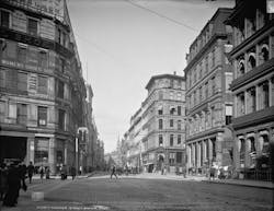
“The building […] is an incredible piece of Beaux-Arts architecture that takes up an entire block in Boston,” said Ming Thompson, co-founder of Atelier Cho Thompson. “It’s on the boundary between the leather district and Chinatown, so it’s a really important landmark in the city. […] If you look around the building, it really tells the story of its history and in a great way.”
At the onset of the project, the design team frequently heard how much building occupants and the local community appreciated the historic detailing of the exterior of the building, but the structure’s interior spaces were missing the same rich, distinctive character. Inside, recent renovations already felt outmoded and had left public areas of the building dark and undistinctive.
“What we found when we visited the lobby for the first time and a lot of the shared spaces of the building were that they felt pretty dated and felt like they were of an earlier era of office spaces—so, very corporate, very generic,” Thompson recalled. “It felt like they could be in any building anywhere in the world and not very welcoming or inviting to people.”
In a post-pandemic era, Thompson said the design team wanted the spaces “to feel special, feel very Boston, feel very ‘of this building’ and very unique. So that’s kind of where we started.”
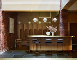
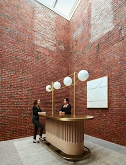
Historical elements that had been part of the original construction, from a brass mail chute to textured plaster walls to the leather used for shoes, were also incorporated into the design. Using a rich material palette of hand-troweled plaster, stone, white oak and polished brass, Thompson and company transformed shared areas of the building into light-filled and welcoming public spaces.
Less Is More
To preserve the building’s historic character, Thompson said the team took a ‘less-is-more’ approach to materials. “Rather than adding, we actually stripped back,” she said.
Decades of changes resulted in layers of materials like vinyl tile and commercial carpet obscuring the building’s textured history. Those layers were removed to reveal original terrazzo flooring in a rich palette of gray, saffron and cream, and expert craftspeople filled missing areas with a near-perfect match. The original brick was exposed wherever possible as well.
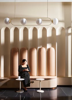
A color palette inspired by natural stone and the use of leather in the furnishings that nods to the building’s history add warmth to the space. Sculptural tables and ornamental brass handrails and footrails lend an air of sophistication.
The project’s scale and rich palette of materials “make it feel not only welcoming but almost like a hospitality space that feels like a special place away from home,” Thompson said.
Envisioning the Future
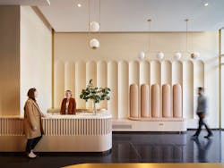
Bringing a historic building up to today’s Class A office standards while maintaining a warm, welcoming aesthetic took careful consideration and planning—and the reception desk is a perfect example.
The design team also sought to improve the functionality of the public spaces, from an under-utilized lobby space to a dark central core to empty pocket spaces on each of five floors.
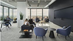
As a result, collaboration spaces were designed for a range of group sizes and workstyles, from high standing counters to cozy banquettes to drop-in benches. These areas offer opportunities for connection and engagement, allowing colleagues to spend time together outside their office or for new connections to be formed. Moreover, they offer a visual and haptic environment that elevates and honors the spirit of the workplace.
“By connecting us back to the history of this grand building, we experience the beauty of historic Boston seen through the lens of a future-focused, dynamic workplace,” Thompson concluded.

