How This Colorful New Children’s Hospital Prioritizes Comfort
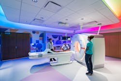
Though confined to a tight, urban site, the decision was made to build the Hubbard Center for Children—a new 10-story, state-of-the-art children’s hospital, effectively doubling the size of the existing space, with 100 new beds, 17 operating rooms, a 20-room emergency department, imaging center and more.
Consolidating the children’s intensive care and cardiac care units, formerly located across the street in another hospital, with Hubbard’s full range of pediatric services, the tower offers an expansive cafe area, chapel and meeting space, intuitive patient check-in and check-out, outdoor viewing and gardens.
Thanks to the 460,000-square-foot expansion and a 100,000-square-foot renovation, the hospital is now equipped to serve more than 150,000 children annually, with close to half traveling in from outside the Omaha metro area.
Colorful and Playful
In designing a new front door for the campus, and its carefully curated interiors, the experience of timid children and trepidatious parents as they embark upon their healthcare journey, both large and small, was top of mind for the architecture and interiors team at HDR.
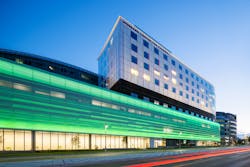
As staff, patients and visitors approach the children’s medical center, their eyes are drawn to a colorful, expanded parking garage adjacent to the new tower with a large digital media screen and perforated skin presenting shifting colored lights.
Sharing some details about integrating the lighting onto the facade, HDR Lighting Design Section Manager Lisa Lyons explained, “The top row of lights is mounted within the exterior cavity while the bottom lights were brought out in front to illuminate the front of the facade to create depth and accentuate the folds within the perforated screen. Together with the client, we digitally programmed many different scenes for various holidays and health awareness events.”
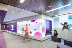
The colors continue all throughout the interior, with hues and shapes assigned to each floor to create excitement and positivity while serving as a wayfinding tool:
- Lower levels: all colors and shapes
- 2nd floor: purple and circle patterns
- 4th floor: turquoise and triangles
- 5th floor: yellow and squares
- 6th floor: blue and diamonds
- 7th floor: orange and hexagons
“The shapes that were chosen increase in the number of sides as you go up from floor to floor,” explained Matthew Delaney, brand + experience designer, HDR, Omaha. “We wanted to make sure the shapes were easily recognizable for all ages. The sketch quality and saturated background help accomplish that.”
The team made sure to stick with standard colors to ensure consistency with colored product options for flooring, carpeting and tile.
Here the wall covering was designed and the ceilings were painted to create an immersive experience. In other locations, the design team coordinated with neutral finishes to enable the lighting, colors and/or graphic walls to be the focal point.
The designers also incorporated colored ribbons that trace along the floor of the main circulation corridors with different shapes.
“Kids can follow those throughout their journey through the hospital, turning even the floor into a sort of game that creates a positive memory. The meandering ribbon lines let children hop from shape to shape or walk the line where the color changes,” explained Laura Franzluebbers, a senior interior designer with HDR.
The designers carried over this ribbon concept from the existing facility, thereby creating continuity. Whereas the older facility utilizes more complicated symbols like stars and starships, the designers choose to simplify the shapes for the new building.
A unitized curtainwall envelope seamlessly ties the existing hospital to the expansion and the two buildings are connected at the cafeteria on the first level and a large community area on the third floor. “This is where the existing and the new language coalesce,” she explained. “The new facility is a new standard, and several of the spaces in the existing facility are being upgraded to create color consistency.”
To further engage the children, touch screens are available in multiple locations where the kids can play different games. There’s also a playroom with a large, panoramic panel scene hiding 20 frogs, which children can search for as they wait for their appointment.
Another interesting feature is a large panoramic of Nebraska depicting Omaha all the way out to the panhandle with highlighted landmarks of the state.
Renovations
The site itself was constrained by a major highway and sat on an extreme triangular-shaped slope. Consequently, the building team had very little laydown space and room to maneuver while constructing the new building and renovating the existing spaces.
To match Hubbard’s interiors, the renovation involved changing out all the finishes in the existing spaces. While the original footprint remained unchanged, a number of areas were expanded, including the registration area, surgery waiting room, the Emergency Department, pharmacy, gift shop and chapel.
The traditional brick cladding on the existing buildings was preserved and serves as an interesting contrast to the new infilled Hubbard Center’s modern facade.
Integrated Project Delivery
The Hubbard Center for Children bears the distinction of being the first integrated project delivery (IPD) project in the state of Nebraska, chosen for the delivery method’s ability to tap the team’s shared expertise and save time on the project schedule.
In preparation, the team visited similar IPD projects across the county and leveraged the services of lean coaches for training and planning. With IPD’s shared risk-and-reward framework, this provides accountability and motivation to the full building team. In particular, the financial model allows team members to profit when criteria such as schedule, budget and quality are met.
“Working in one co-located space with all of the disciplines together allowed us to share ideas and understand the reason behind each decision as a team. It was a more seamless coordination because of that environment,” reported Franzluebbers.
In employing an IPD strategy, this allowed the team to begin construction prior to submitting its final bid package for interior fit out and final work. With a higher level of collaboration, there was less downtime and waste.
A Job Well Done
As members of the Omaha community, many of whom are benefitting from the new Hubbard Center for Children, the building team had a lot to say about the experience.
“It was really amazing project to get to work on. Multiple members of the team, myself included, have experienced the hospital with our children, so we wanted to create a place that is a wonderful experience for the patients and families and the amazing doctors,” stated Lyons.
“Following the client’s social media, you get little glimpses of the spaces and it feels good to know that our team was such an integral of part. It is really neat and gives you the warm fuzzies,” added Delaney.
In conclusion, Franzluebbers expressed her appreciation for working on this noteworthy project. “There’s a lot of pride being able to be involved in something where you live and you pass so often. It’s such a key beacon in the city, so to be able to work on that is really rewarding.”
About the Author
Barbara Horwitz-Bennett
Barbara Horwitz-Bennett has been covering the AEC industry for the past 25 years. She writes for a number of industry magazines and works with AEC firms and product manufacturers on content writing projects.


